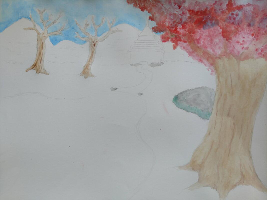
Watercolor Landscape Project
|
|
1. What watercolor techniques proved to be effective in your painting? How and Why?
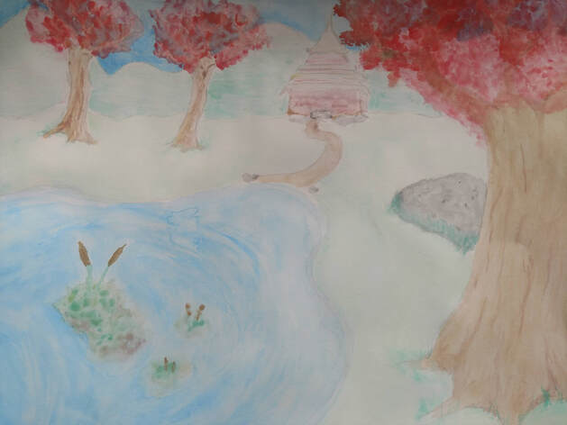
For the most part, I would say the splatter technique. I used it for the large amount of flowers on the trees. It made it much faster and much more exact to my reference image. Wet on wet also was very useful for the water and the moss on the rocks.
2. How important was using transparent layers in your painting?
I did not use clear layers too much as i used wet on dry a lot. However the water definitely shows that i tried to incorporate it as a body of water. It allowed the water to seemingly have more "layers" and look more natural.
3. Explain how your composition was successful? Did you utilize all the elements of art and principles of design? Explain.
My composition was successful due to the amount of colors present and the way the objects in the painting are placed. I made sure the building wasn't exactly in the middle and balanced the trees, placing one really close and two farther back. Although the perspective could use some tweaking, the stuff closer to the front is much larger than the background mountains.
4. Was color choice an important factor in the overall success of the painting? Why?
Id say the flower petals where the most important in the terms of getting the color correct. I used three different shades of red to try and make different densities and had to make sure they looked pink enough to be cherry blossoms. I also had to work with the browns i had to make a light bark with accents, which was not easy but it made the painting pop.
5. Describe your craftsmanship.
Water color painting is not my strong suit. But I feel as if my way of making the plants is unique. The moss especially, consisting of a bunch of odd colors to make it seem more natural and mucky. I also believe my usage of white watercolor to add a hint of fog to the back made it look much better.
6. If you were able to do something different what would it be and why?
I would put many more layers to everything. I would also do my building in the back a bit better but i did not have the best brushes to do what i wanted. Mostly I would use my time much better to add more detail to everything so it looked more like the reference image
7. Explain to me what you have learned about watercolor and how it has improved or discouraged your development in art.
I learned how to best use the very wet medium to make some unique patterns and how to best mix watercolor. I've never thought id ever be able to make much with watercolor, but i managed to make something I'm proud of. This for sure brightened my horizons with using watercolor as opposed to acrylic.
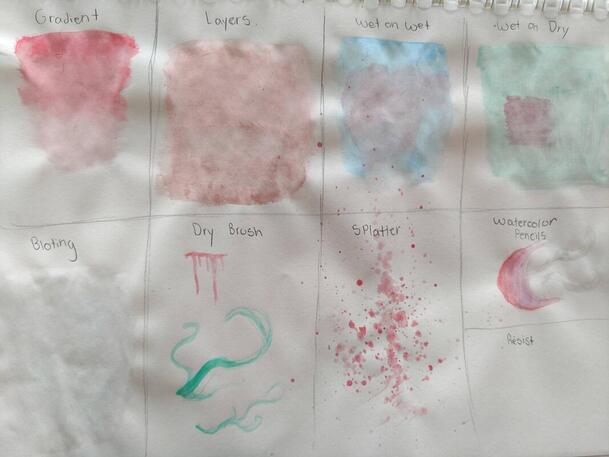
Watercolor Techniques
|
Here is my page for the watercolor techniques practice. I did not use all of these techniques for my final, but I did put heavy use of the most applicable ones. The splatter technique is by far my favorite, being the most erratic and unpredictable just makes it that much more fun to use.
|
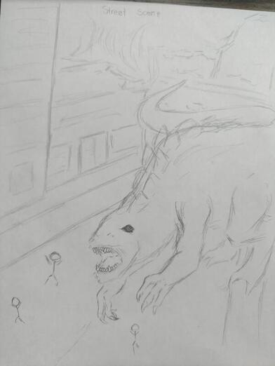
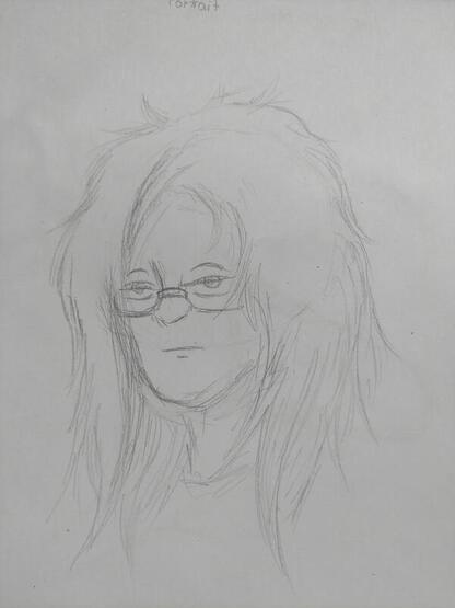
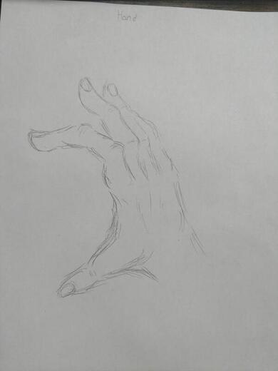
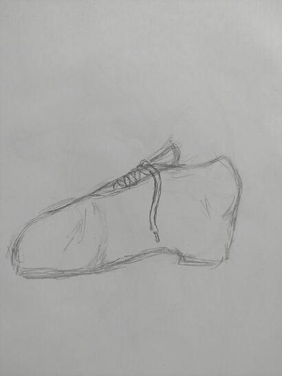
4 Assesment Drawings
|
|
These are my 4 asessment drawings for this semester. The topics where a street scene, a hand, a portrait, and a shoe with laces.
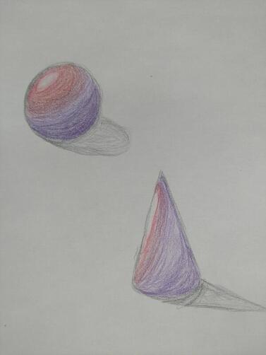
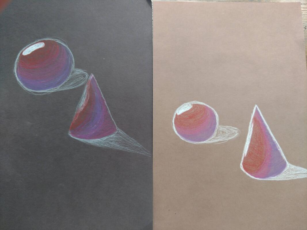
Colored Pencil Forms
|
|
Our first practice with colored pencils and forms was to draw a sphere and a cone. At the time i did not have the paper so my first drawing, that was meant to be on grey paper, is on my sketchbook. However I did finish my black and brown paper drawings.
Hunderwasser Painting - Mining The Moons
|
|
|
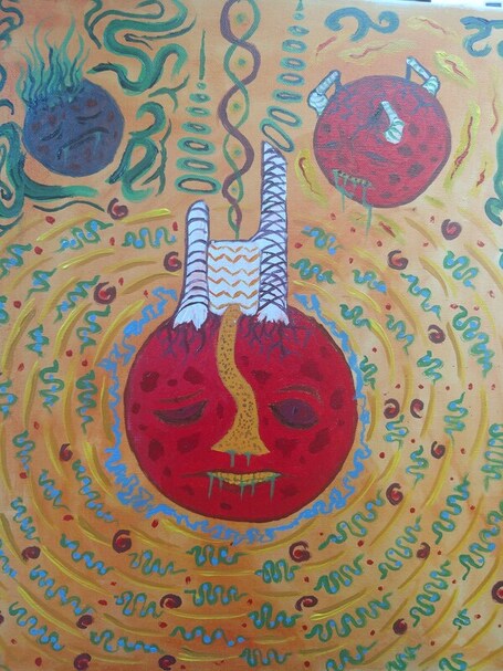
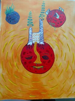
1) Personally, I feel as if this is one of my best paintings I've made. I took a long time to make sure I had lots of details and that the outlines where clean. Using the orange background to my advantage as the painting background, not just a color enhancer, and had it match my odd and diverse color scheme.
2) Hunderwasser's art style is based around a diverse color scheme, faces in odd places, and very strange environments that don't quite make sense at first look. I feel as if I did very well, but I could've done much better. My piece focused on the odd environment and faces in odd places.
3) I picked red for the two large moons that have expressive faces and gave the "Dead" moon a blue hue. The red is much brighter and gives the two live moons more lively. The green is also an important color as it is the inside of the moons. The dead moon is broken open, spilling out green gasses. The two other moons don't have as much, and the mid moon is dispersing the green gas out of the odd building.
The whole idea is that the colors i chose are very very bright and lively, the only exception being the dead moon.
4) The focal point of my painting is the moon near the center and the building seemingly attached to the moon itself. It has no real meaning, but it is implied that the moon is uncomfortable with this large unnatural object in its surface.
5) Most of the texturing can be seen on the moons themselves, with the craters being present on all 3. The patterns are mostly around the largest moon itself. Squiggles, swirls, and dots surround the moon as an aura of patterns.
6) I chose not to make a border on my painting. I feel as if it wouldnt work with the space theme i had setup.
7) One of the difficulties I had was coming up with more patterns to add to the painting. I also had some trouble making sure the colors where put in the painting in a nice way, making sure not to be too confusing while still making the viewer take it all in.
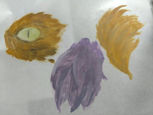
Oil Paint Fur Practice
|
|
|
I was assigned some fur practice with oil paints in preparation for an animal portrait. I'm not sure how I feel about using oil paints. At this time I thought they where really strange to work with, very thick and slow drying. Although i liked it much more than watercolor paints as it was similar to acrylic.
|
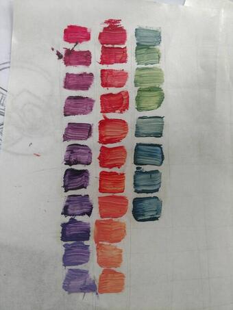
This was the 100 squares challenge that I unfortunately never got to finish. I had very limited time to make them and I was only able to make a few. But even so I still feel like I had a good grasp on how oil paints mixed.
|
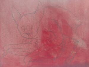
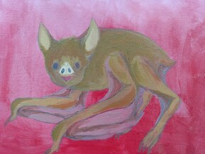
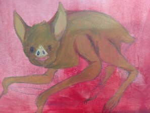
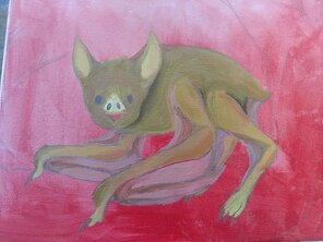
Animal/Pet Portrait
|
|
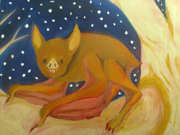
For my Animal painting, I decided on a vampire bat to be my subject matter. I wasn't super confident in my ability to draw long fur, so a bat was perfect and would be a unique animal choice. The tree was an odd thing to think about, as I didn't want the bat to blend in with the tree too much. The colors I picked where a lighter brown or more of a birch white.
The usage of greens on the bat really helped bring out the idea of layers and shadows as well as on the tree. At one point I used the wrong shade of blue, but in the end it made the sky in the back look even better!
At first I was not confident in how my painting was going to look. I did not like using the oil paints but as I used them more, I started to get used to how they worked and how long it took them to dry. As I continued I really felt like I understood how to mix the paints so my colors looked better.
With my current ability, I feel as if I did a wonderful job on my painting. One thing I will say is that I could've made the fur more textured, but overall I feel as if the craftsmanship is very high.
Choice Project-Textured Landscape
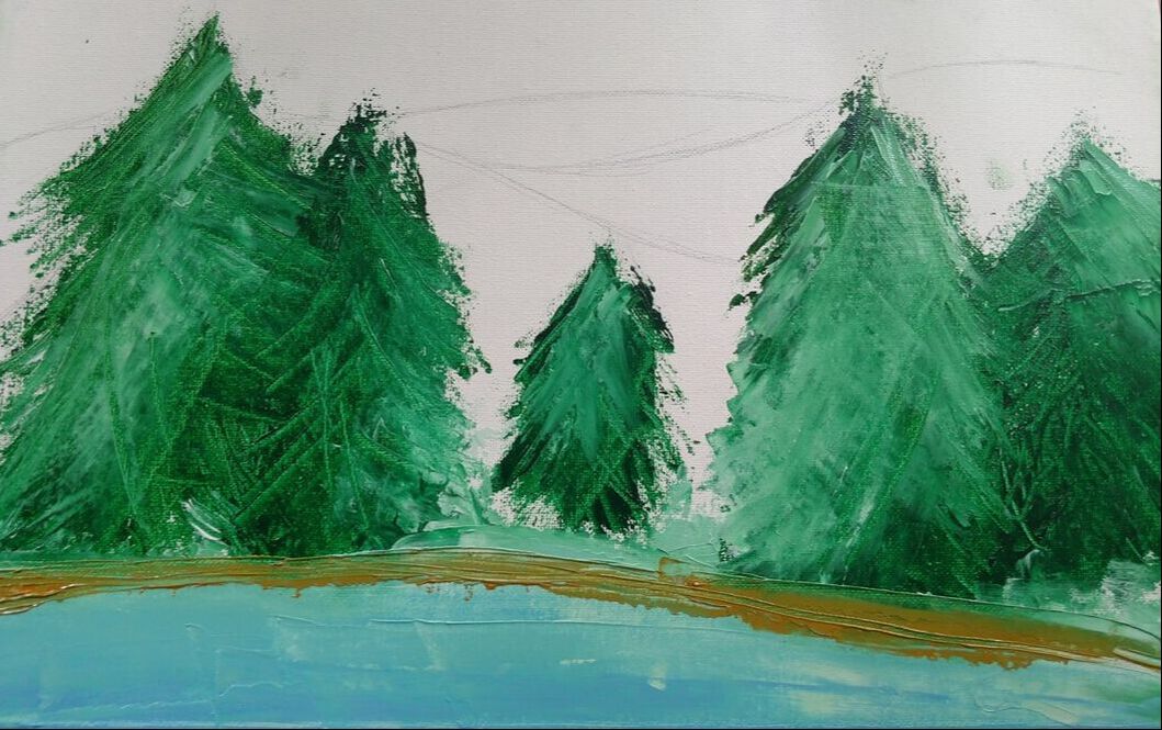
This project was not able to be fully completed, so I will base the critique on what I have and what I planned for the finished product.
At first I was not sure how well the painting process would even go, as using the palate knife seemed difficult to use. But as I did more, it was still difficult but I was loving the feel of the painting. With how much I was able to get done, I did make many mistakes but I was able to turn the mistake into a part of my painting. I made the wrongly mixed colors into a frozen lake!
The way the pine trees where made are by far the best and most well made part of the whole thing. Using a scraping technique and putting more pressure on the tip gave a needle texture and eventually it helped me improve the layering of the paints.
The improvised bank of the lake, has a muddy feel to it due to the rougher way I used the scraping technique.
I had planned to do the colorful sunset in the back as well, I would combine the colors on the painting itself to give a smoother feel.
Overall I feel as if this painting could be one of my best and most well made paintings as the way to make it is unique.
