White Board Animation Mini Project
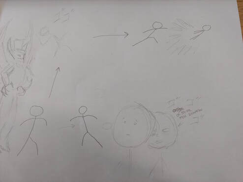
This is the planning page for our stop motion animation.
We did not have to draw out all of it because we had a good idea of what we wanted to do. |
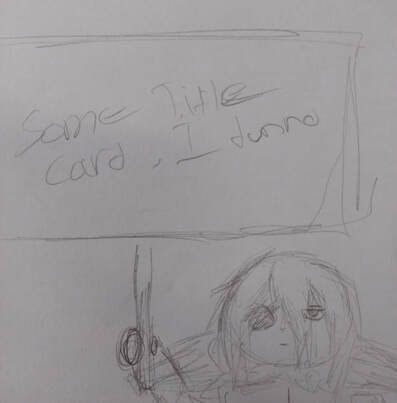
I personally made the title card. We couldn't decide on a title so i put some placeholder text on the sign.
|
|
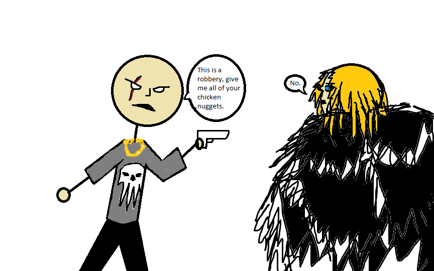
Illustration Friday- CriminalThis was made in microsoft paint. It shows a random robber demanding Dimitri's chicken nuggets. However, he does not care and refuses to hand them over. |
Clones of Me - Photoshop Project
|
What problems were there and how were they solved?
The main issue I faced was getting as much "white space" to be erased at possible. Since the photos were taken at different angles, they had to be shifted and masked in a way where it looks as similar as possible. The masking was especially difficult around where my hair is. If I could, what would I change about my final result? Personally I really enjoyed the project. It can be as complex as you want and you can still meet the requirements. Although it was a bit difficult to get the pictures how I wanted them. If i did this again, I would add move versions of myself and make it more "cursed" (mysterious and creepy looking). |
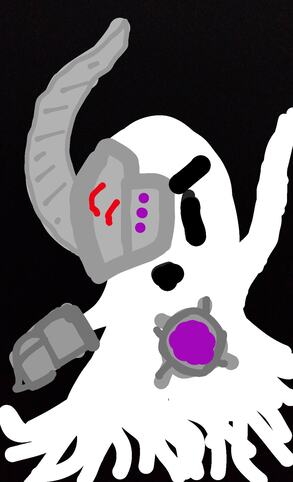
Illustration Friday-FutureFor this topic I made a Cyber Ghost. It's just a spooky ghost with some robotic enhancements to make him extra spooky. I made this image on my phone.
|
|
|
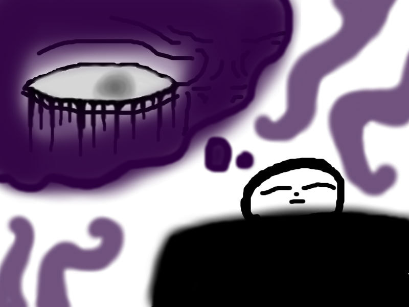
Illustration Friday-DreamsFor this illustration friday, I made it so the person was having a bad dream with a strange entity. It fit well with my dark art style. I made this in Pixlr online.
|
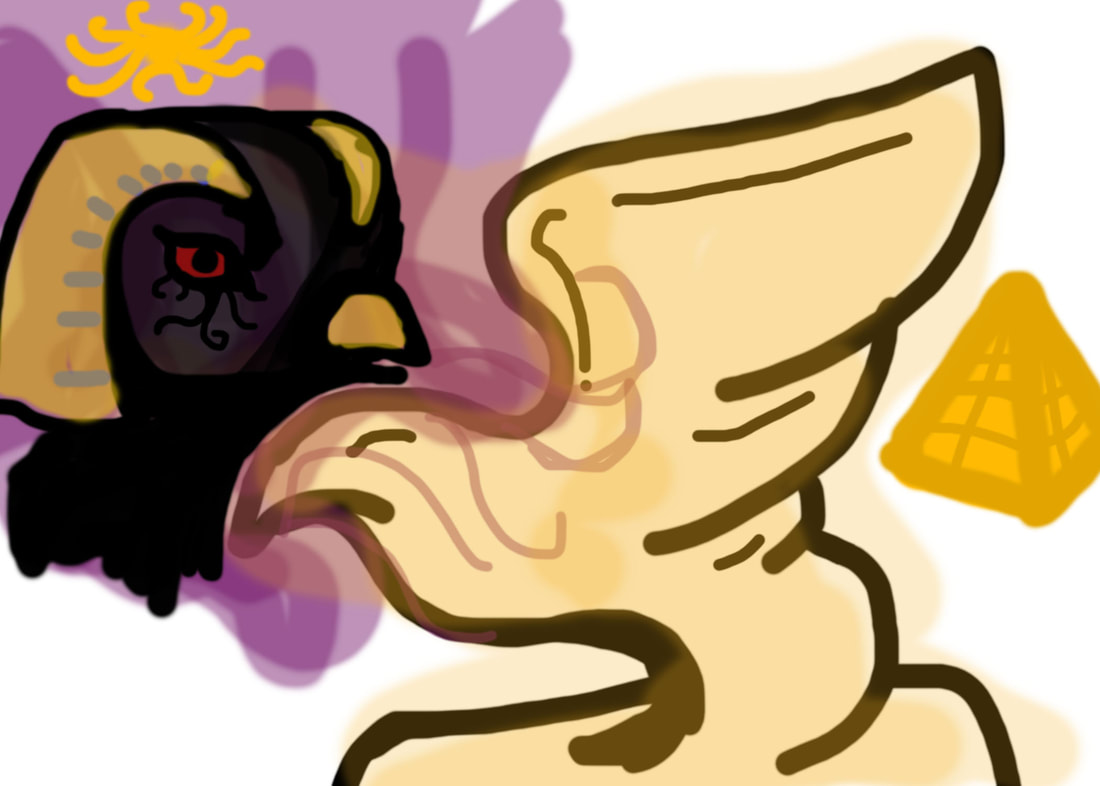
Illustration Friday-HistoryFor this illustration I show a golden bird statue with a slight glow effect. I made the bird on the side in a egyptian god-like style with the golden headdress and the eye design. The pyramid on the side was to also help make the egyptian resemblance.
|
|
Show Stopper
|
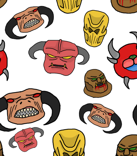
Pattern ProjectMy theme for all of my patterns is DOOM demons. They are my own versions of DOOM sprites. Out of the whole project, I found that the hardest part was making sure the colors where not unappealing and complimented each other. I cant choose a favorite, I like all of them! Something to reccomend to someone doing the project, I would tell them to keep the designs simple and make sure they can make a pattern that looks nice.
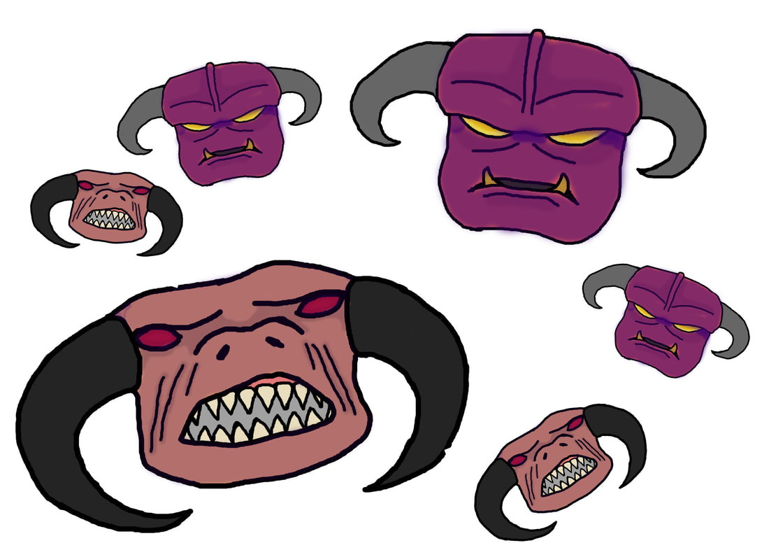
Purple Tinted Demons Pattern
|
Creature Feature Halloween
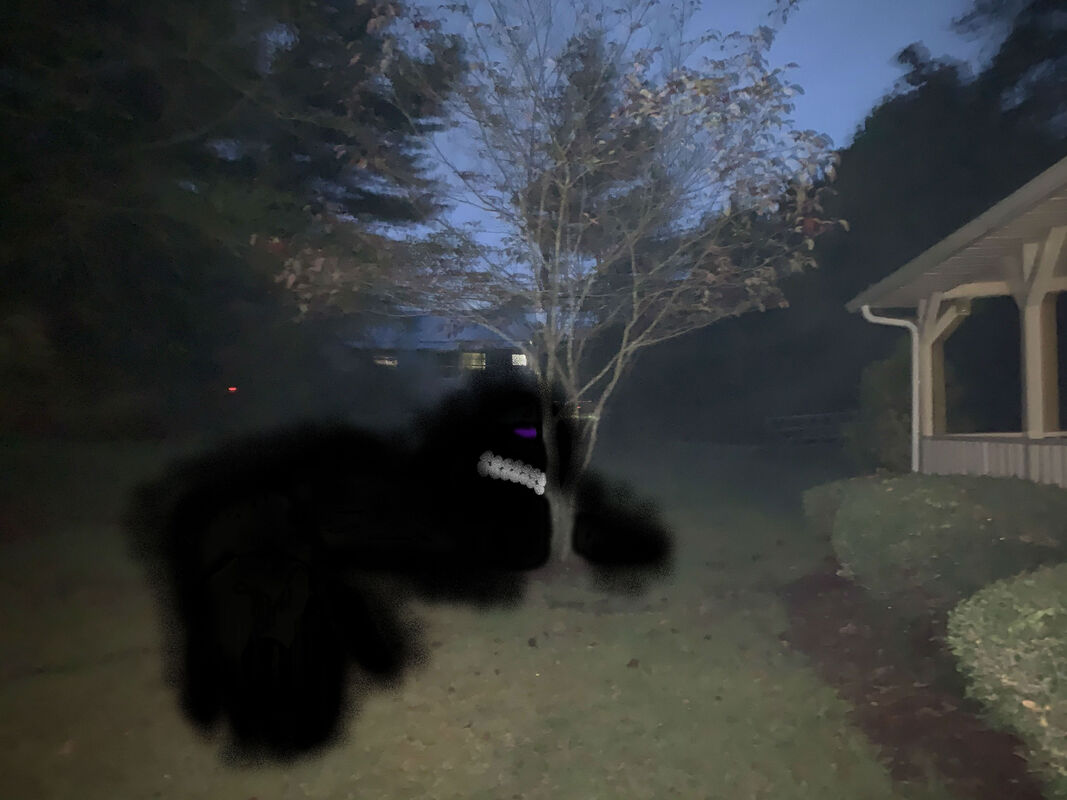
Image Location- Ms.Sudkamp's backyard.
This is Chris. He is a common visitor of the house. He is often seen stuck in the ground and asking anyone nearby if they can help him out. He is not a mean monster, he will gladly talk about anything once he has been helped out of the ground. Great with kids and with any pet you may have. A majority of the piece is multiple layers of a opaque black and the outline is a layer of a spraycan-like effect to make it look misty. |
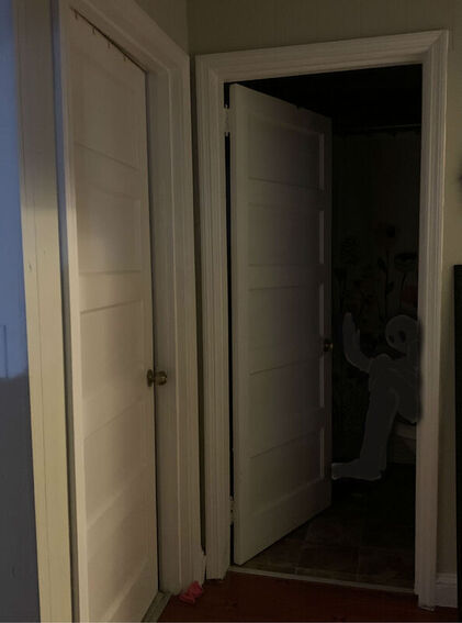
Image Location- Ms.Sudkamp's hallway.
This is Max. He is shy and does not like people. He has been in this house for a while and has gotten used to the people who live there. He is too shy to come out of the bathroom but is giving a nice wave from the dark room. He does not want to scare anyone. This was difficult to do because I had to layer multiple coats of a opaque black to make it as dark at the background. |
|
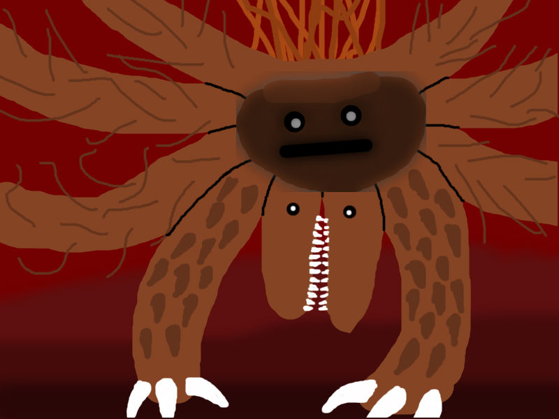
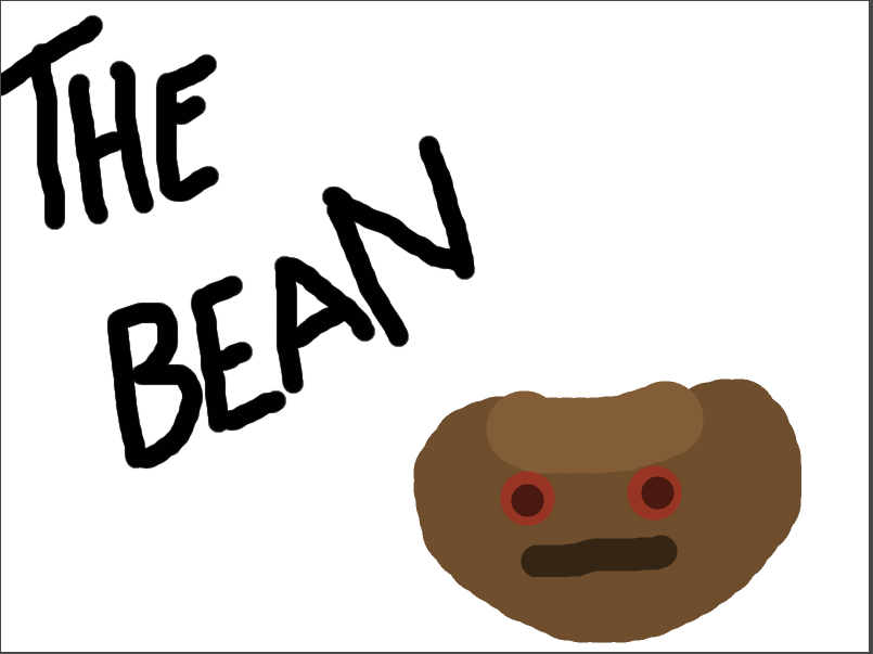
Illustration Friday- MonsterThis is a monster I made based off of another one. I call him "Omega Bean". Bean is a re-occuring character with horrible powers of evil and "badness". There is more than one bean, but this one is the only to have reached "Omega" status.
The Original Bean \/
|
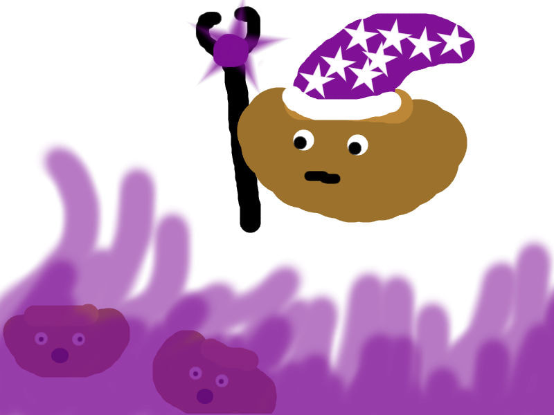
Illustration Friday- MagicThe all powerful bean now has a mage hat and a staff. He did not mean to hurt the other innocent beans with his magic. He is learning how to use it properly.
|
|
|
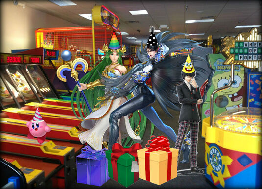
Illustration Friday- GiftsThis illustration Friday image was made on a fictional characters birthday. I made it so she has other characters and they all go to Chuck E Cheese to celebrate, play in the arcade, and open gifts.
|
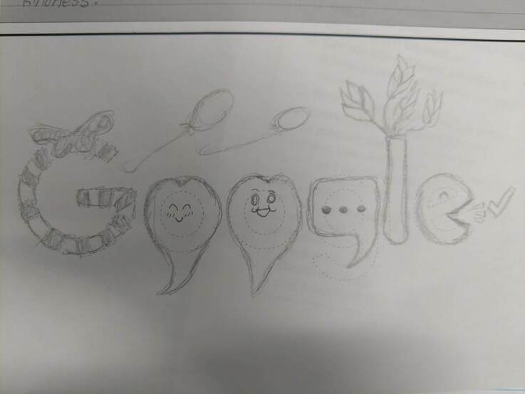
Doodle for Google
Computer Arts Final (What I was able to get done atleast)
|
|
|
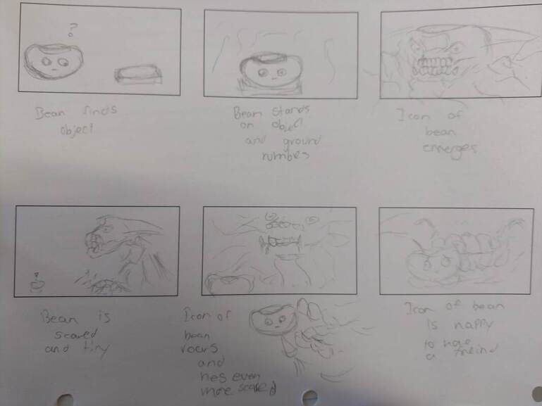
Planning Images
Final Exam Questions
1) My original idea was to computer animate the whole thing, frame by frame. Due to program issues, I can only give the planning images :(. It would be a story about one of the bean people finding a circle on the ground. Stepping on
2) What I would have done was make specific frames and then eventually animate the in-between frames. I could re-use frames to keep the proportions accurate and color them after I had animated enough.
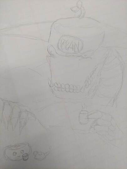
3) The most difficult thing for me was trying to figure out how i would even animate it. If I could animate my idea, the hardest thing would be putting detail into the large demon while its moving. It would take up most of the frame at all times.
4) The most succesful part would be designing the characters I wouldve used in my animation. I am good at making individual characters that have personality. The bean would be a silent protagonist that would only use his eyes and mouth to express emotion. The Icon would be a very loud and animated (haha) character that would use his entire body to express his emotions.
5)Staging- This would be used through the entire animation as the background and the atmosphere would change.
Pose to pose animation-This wouldve been the animation style used for the entire animation. It seems easier and there would not be a reason to do frame by frame.
Exaggeration- This principal would mainly be seen with the icon. He is very large and his movements would be very drawn out and take up alot of room compared to the bean.
Squash and Stretch + Anticipation- These principals would mainly be seen with the bean. He is a rounded object so he would jump to move. He would have to squish in order to show hes about to move and once he is off the ground, he would stretch to show his movement.
Appeal- The bean has a simple design and has colors that dont hurt the eyes so hes appealing by simplicity. The Icon would have much more detail and and would be a much more complex shape so he would be appealing due to complexity.
6)What i learned about animation is that it takes a very long time to make just a few frames of animation. It also can be derailed by tech issues and program issues. It is painstaking and is something you have to practice to get better at.
1) My original idea was to computer animate the whole thing, frame by frame. Due to program issues, I can only give the planning images :(. It would be a story about one of the bean people finding a circle on the ground. Stepping on
2) What I would have done was make specific frames and then eventually animate the in-between frames. I could re-use frames to keep the proportions accurate and color them after I had animated enough.
3) The most difficult thing for me was trying to figure out how i would even animate it. If I could animate my idea, the hardest thing would be putting detail into the large demon while its moving. It would take up most of the frame at all times.
4) The most succesful part would be designing the characters I wouldve used in my animation. I am good at making individual characters that have personality. The bean would be a silent protagonist that would only use his eyes and mouth to express emotion. The Icon would be a very loud and animated (haha) character that would use his entire body to express his emotions.
5)Staging- This would be used through the entire animation as the background and the atmosphere would change.
Pose to pose animation-This wouldve been the animation style used for the entire animation. It seems easier and there would not be a reason to do frame by frame.
Exaggeration- This principal would mainly be seen with the icon. He is very large and his movements would be very drawn out and take up alot of room compared to the bean.
Squash and Stretch + Anticipation- These principals would mainly be seen with the bean. He is a rounded object so he would jump to move. He would have to squish in order to show hes about to move and once he is off the ground, he would stretch to show his movement.
Appeal- The bean has a simple design and has colors that dont hurt the eyes so hes appealing by simplicity. The Icon would have much more detail and and would be a much more complex shape so he would be appealing due to complexity.
6)What i learned about animation is that it takes a very long time to make just a few frames of animation. It also can be derailed by tech issues and program issues. It is painstaking and is something you have to practice to get better at.
