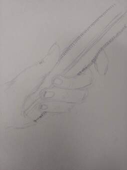
Hand Drawing
|
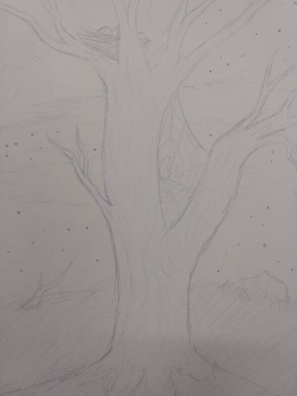
Tree in landscape
|
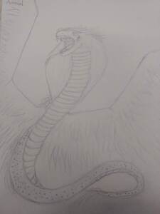
Snake with wings
|
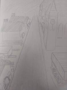
Medeival Town
|
This was the opening assignment for the class. We where given 4 themes and where told to draw those themes to the best of our ability. I decided to draw unique images for each one, like making the "street" theme into a olden dirt street.
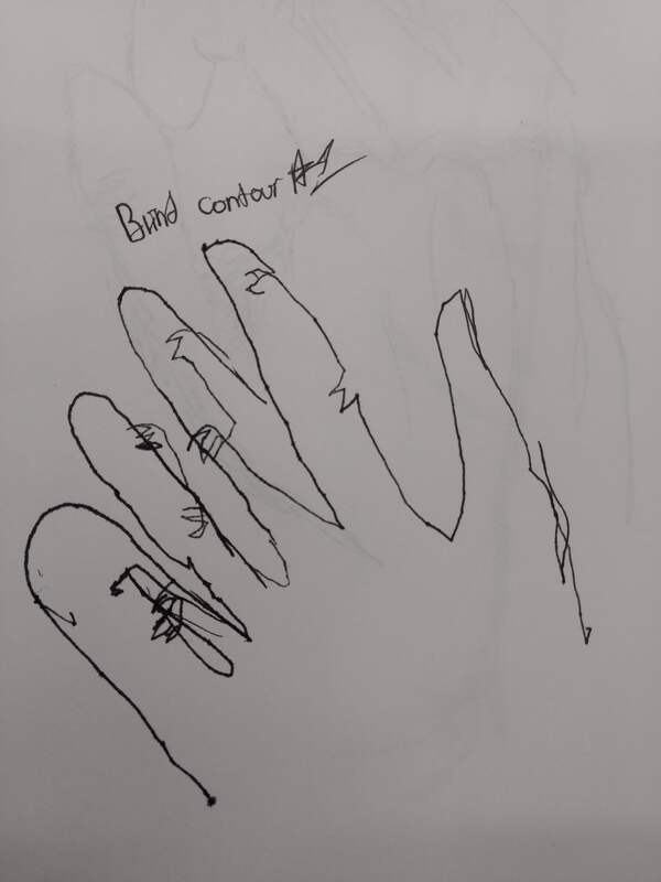
Blind Contour 1
|
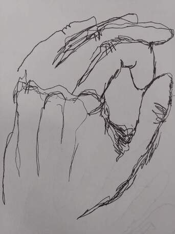
Blind Contour 2
|
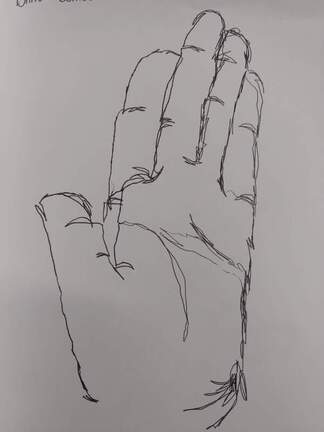
Blind Contour 3
|
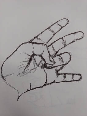
Modified 1
|
Modified 2
|
Modified 3
|
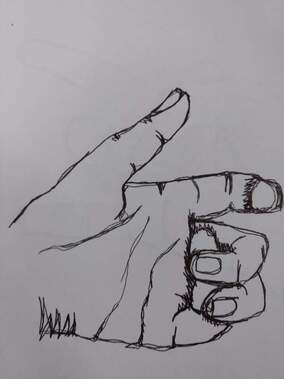
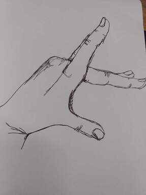
This assignment consisted of drawing my own hand, first without looking at the paper, and then looking at both the paper and my hand. The idea was to use a single line to draw the details in an object (trying not to pick up your pen.)
Backpack Contour
|
Shoe Contour
|
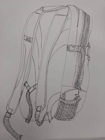
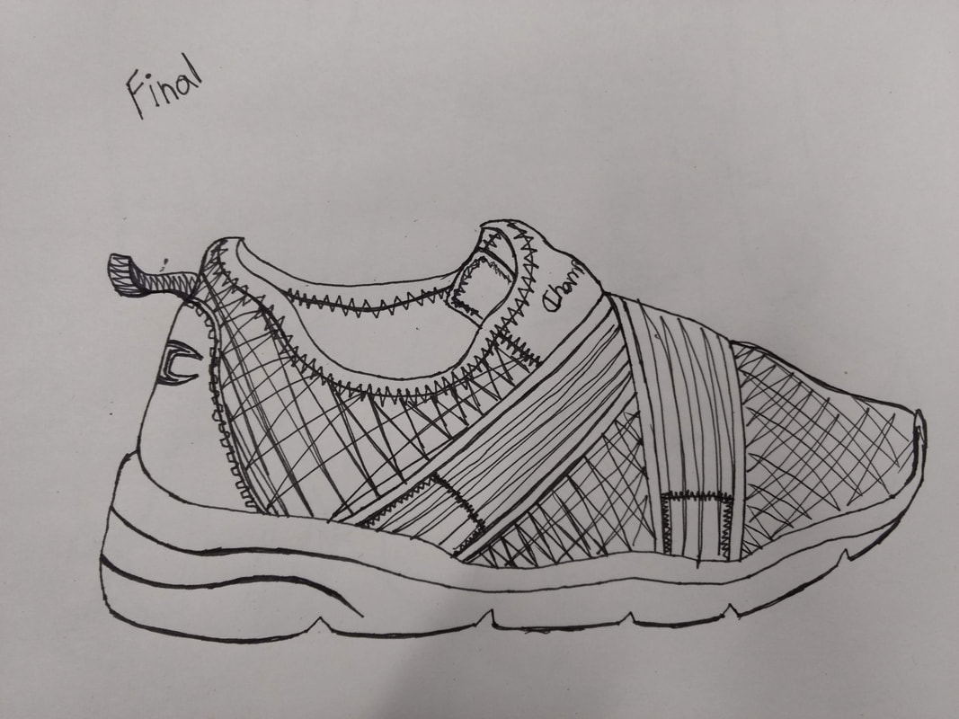
For this assignment we had to practice drawing the contour of real life objects. My shoe does not have as many details as most of the others i've seen. I used someone else's backpack and had it at an angle with the back somewhat facing me. I find contour drawing harder than what i'm comfortable with.
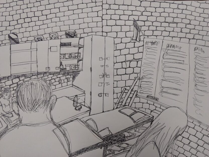
Room Contour- (Practice used as Final)
1) All of the major parts are made with a solid line. However the entire thing is not a single line. I did my best for it to be as few separate lines as possible but it was very difficult.
2)My knowledge with keeping a steady line helped me get a better result with the brick walls. Also, the practice with the shoes and backpacks helped me with perspective.
3)My contour drawing attempts to get as many inner details as possible while an outline would only get the outer most details.
4)My interpretation with what a line is changes how I would draw my perspective of the room. My idea of a line is a continuous line, not always a strait line. That effected how I drew the bricks on the walls in a skewed way.
5)I learned that it takes a lot of effort to make an effective contour drawing. The perspective of the room is not very consistent and is probably I would try to fix if I could make this again. I would also try to keep my line consistent and less sketchy, something I struggle with.
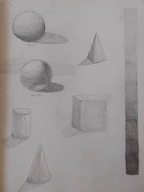
Form Shadow Practice
This was a classwork assignment where we practiced how to shade different basic shapes. im much more comfortable drawing with pencil so this was more of a review for me.
|
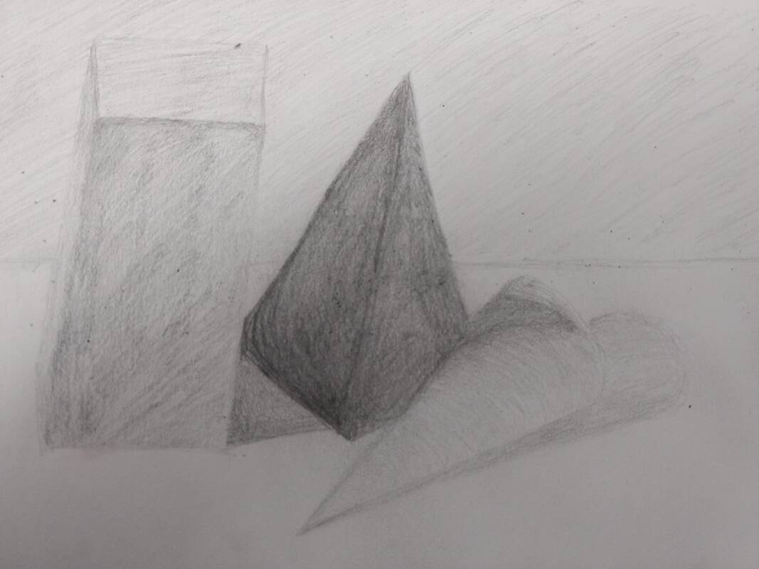
Practice Still Life
We also had to draw a basic still life of three, overlapping shapes. There where multiple shadows wich made it confusing at times.
|
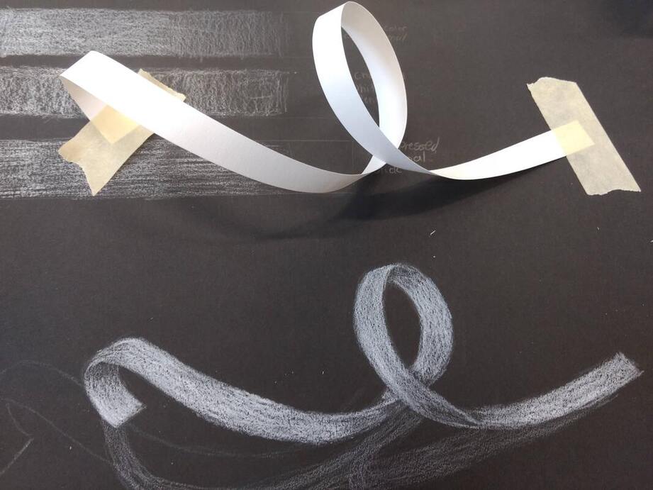
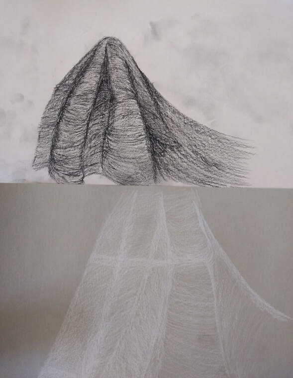
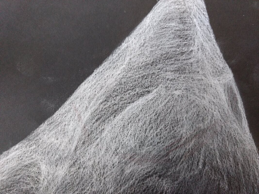
Ribbon Drawing- White on Black Paper
This assignment was a practice for drawing harder on the lighter parts of the paper (using white on black), It was new for me to completely reverse the shading type i have been used to doing for so long, but I think the ribbon image came out really nicely.
|
Fabric Drawings-Charcoal, Colored Pencil
This classwork assignment had us shade a piece of fabric on three different paper colors and three different pencil types. I feel that the charcoal was a bit more time consuming because of how soft it was. I also had an easier time shading the darks rather than whites.
|
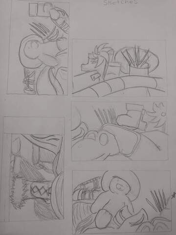
Composition Sketches
|
In Progress 1
In Progress 2
|
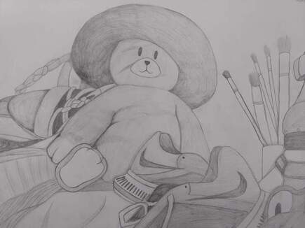
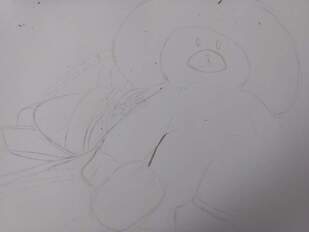
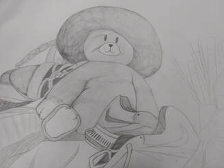
Sill Life-Final Product
1) The finished product of the still life has very obvious and dark outlines that make sure the different shades don't unintentionally blend together. There ended up being more white space than intended in the end but the amount of objects in the image balances it out. Some of the pencil got smudged, especially on the bear but it does not take away from the overall quality.
2) The values that I used are slightly unrealistic. I attempted to use a variety of values, especially in the different shoes and the shadows. Values are important because they can show different textures and depth.
3) There aren't too many shadows that are present over each object which shows the light source is coming from above.
4) The compositional sketches where important to help choose a balanced composition from a variety of objects and position before you put work into a rough draft.
5) My final was successful because it shows a variety of textures and values. It shows the topic was done to the best of my artistic ability.
6) All the items are seen at a perspective that was looking up at an angle and are proportional in size to the original image. The items at the front are larger due to the perspective.
7) Because the objects are spread out and the object of interest is not directly in the center, the composition is pleasing to the viewer.
8) The center of interest, the bear, is slightly located to the left. Its not located directly in the center of the image and balances the other objects.
9) I felt like I did not put as much work into it as I could but that would've taken much longer than the time provided. If I worked more diligently, I could probably improve my work quality in provided time.
10) My main challenge during this project was making sure the shades did not transition incorrectly. I attempted to overcome this by going in softly first and going over specific areas again to make them darker.
11) What I learned while drawing a still life is that everything has a value, its not just light and dark, its all different shades and highlights.
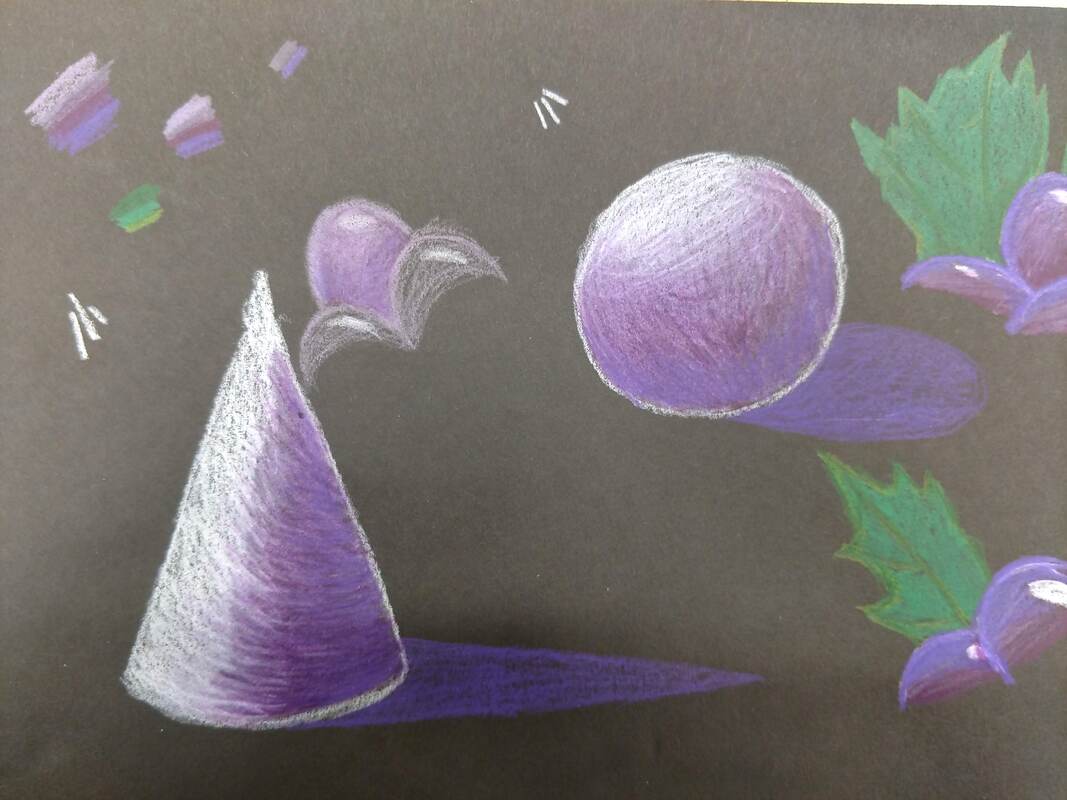
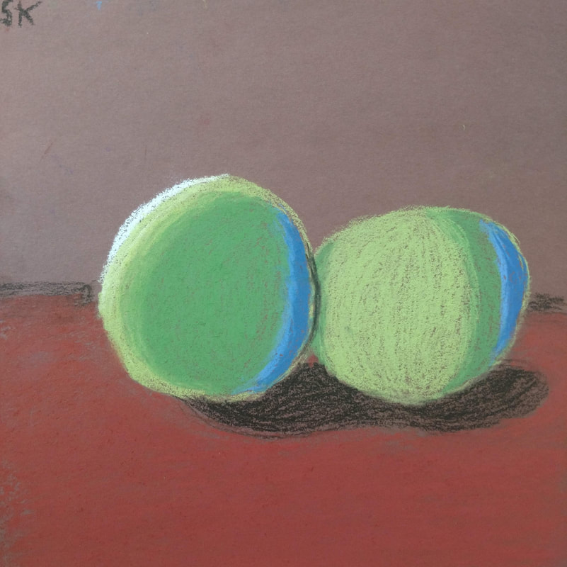
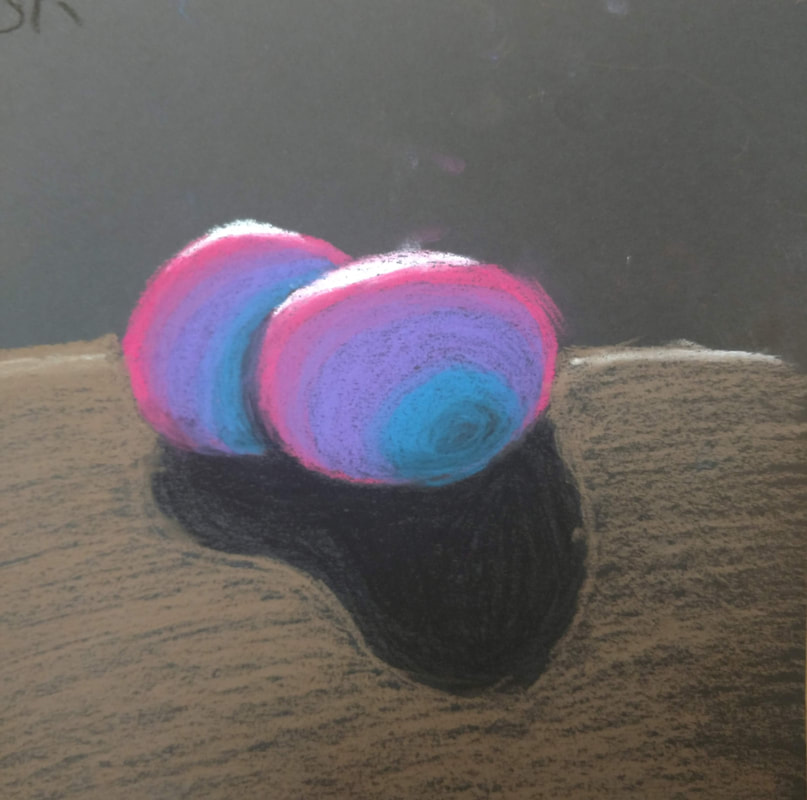
Cone and Sphere on Black
|
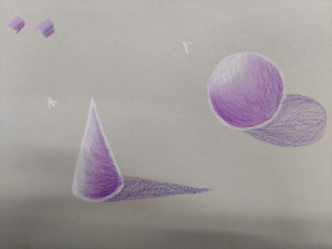
Cone and Sphere on Grey
|
Cone and Sphere on Brown
|
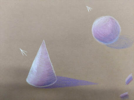
This assignment was to see how the same colors would look on different paper colors. We had to shade a circle and a cone on black, grey, and brown paper. I also did some practice sketches of my grape image on the black paper. The colors looked more pronounced on the black paper.
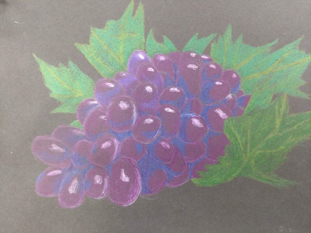
Grapes made with colored Pencil
The colors I used to make the grapes was 3 different shades of purple, white, and a deep blue. I also used 3 different greens to make the leaves. The shading was a bit difficult but I like how the leaves turned out.
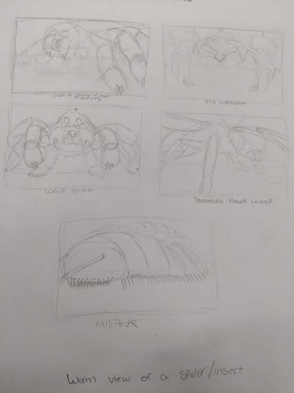
Bug Sketches
|
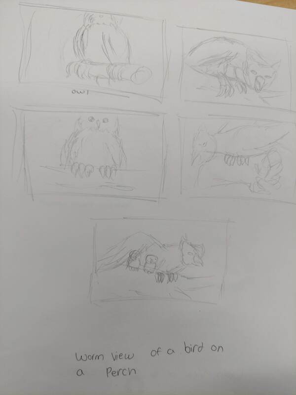
Bird Sketches
|
Final Sketches
|
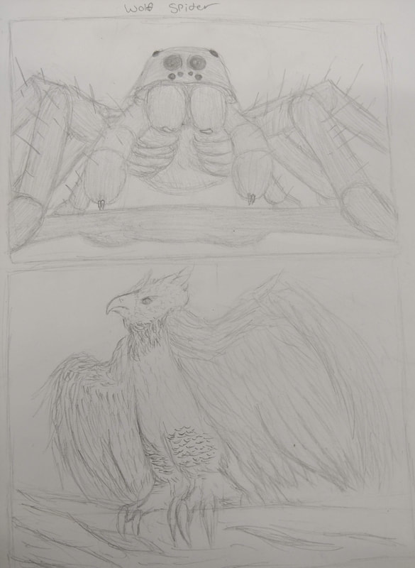
For the sketches, I did Bugs Or Birds for my final project ideas. I decided to do a variety of bugs to try and get one that was the most interesting for me. I also did this with my bird sketches. I used a harpy eagle and a Wolf spider for my final idea sketches. Both of my sketches worked with worm view.
In Progress 1
|
In Progress 2
|
In Progress 3
|
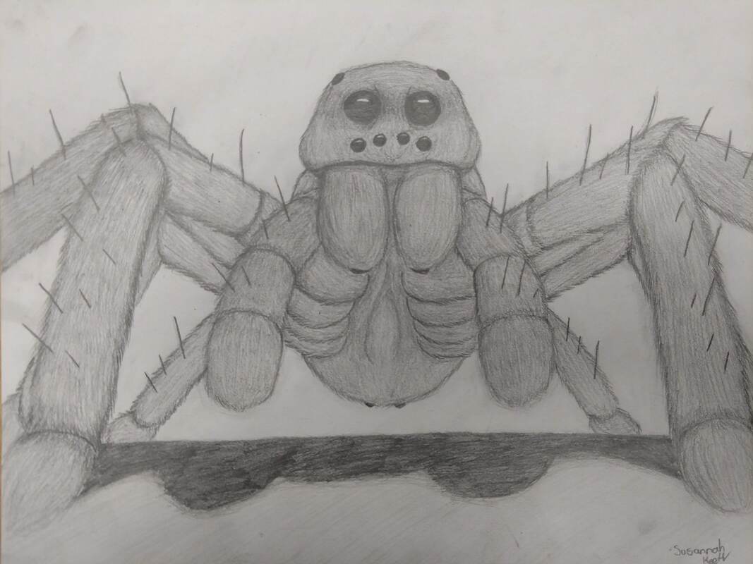
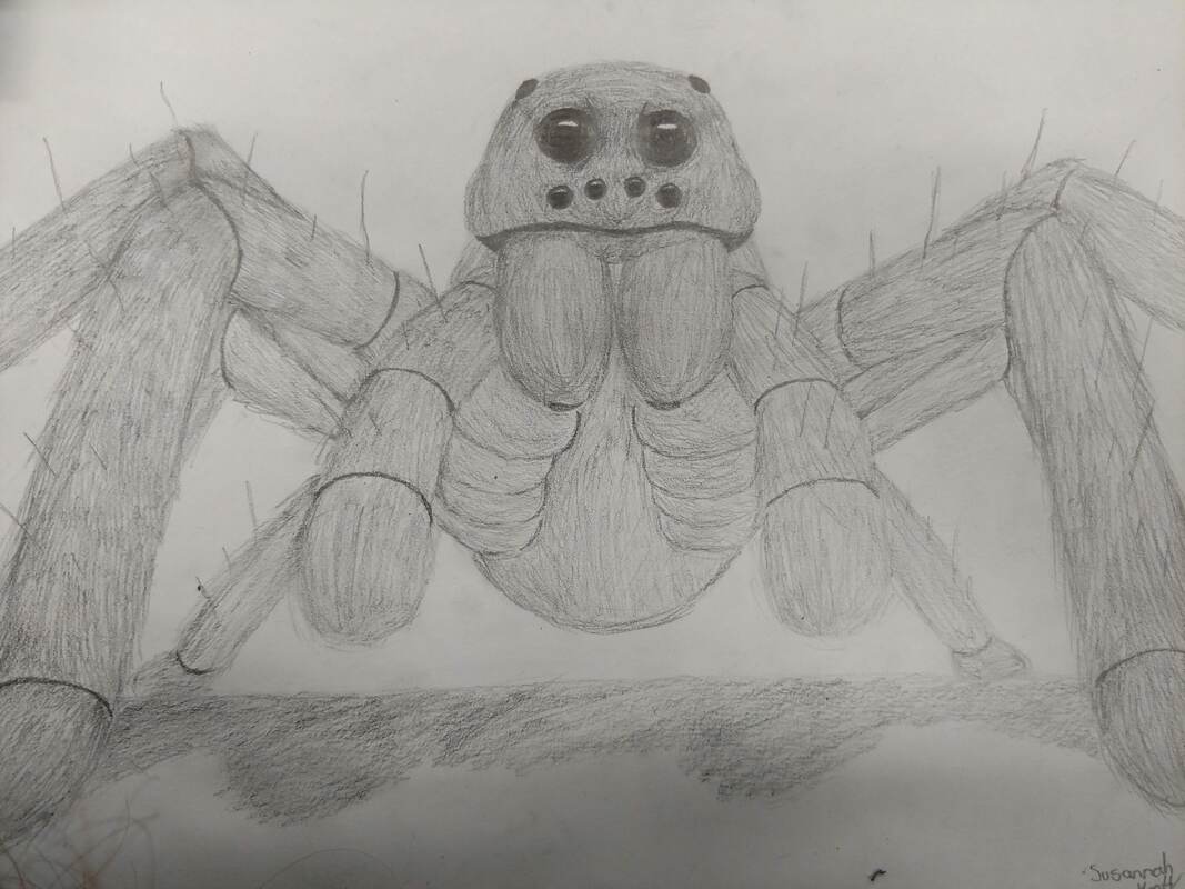
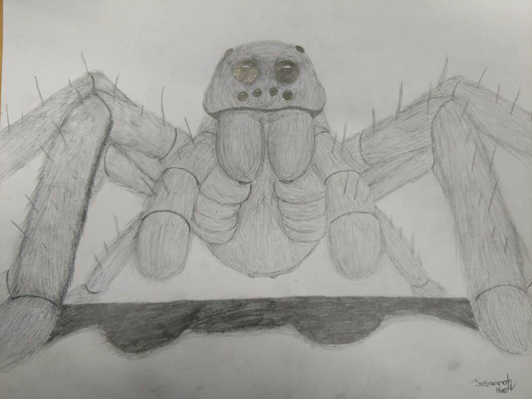
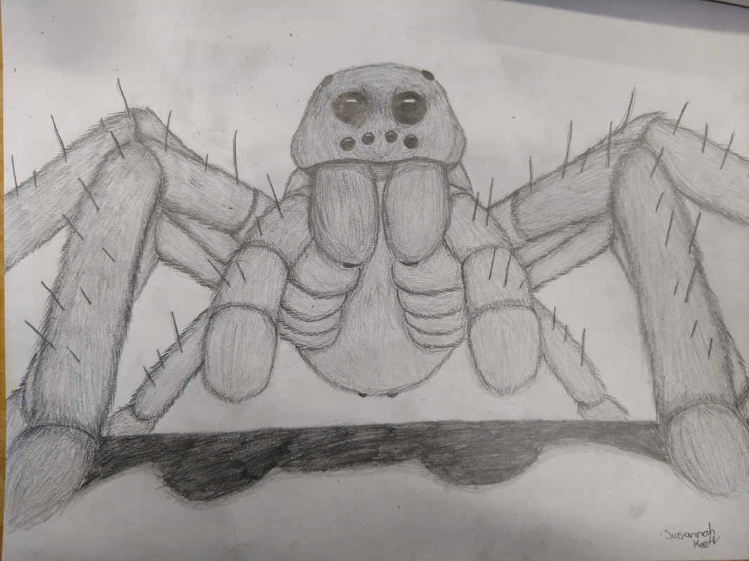
Perspective Final- Wolf Spider
1) Since spiders are small creatures, I decided to make the point of view looking up at one to make it appear larger. It was a success however would've looked even better if I added a background.
2) Its important to understand perspective so you can make drawings more realistic and pleasing to the observers. Bad perspective can make a drawing look akward or strange.
3) Although I did not use colored pencil, the practices helped me with shading and adding the hair, which required me to do multiple layers of lines. It also helped me understand how much pressure I needed to use for specific shades.
4) I feel that I did very well on the project and crafted it to the best of my ability. The shadows make sense and are used to establish depth. Most of the hair was made with hatching in multiple layers.
5) I showed most of the depth with shadows in the legs and the bottom of the spiders abdomen. The back "feet" are a little bit cut off by the surface its standing on and the shadow is cut off there too. The lack of a background does not add to the depth.
6) My experience with colored pencil/charcoal pencil helped me with establishing shape and shading. I have more knowledge with regular pencil than colored pencil but I used my aquired knowledge with depth to help me.
7) I feel like i was very well taught to do this project. The one thing I wish I could have been taught more would be drawing the hairs and how to make the eyes look more reflective.
Cool Colored Egg
|
Tri-Color Egg
|
This classwork was for learning how to appropriately shade with different colored charcoal. We had to take colors of a theme and shade eggs accordingly. It was much more difficult to combine colors what where not complementary but I prefer how they turned out. The colors are more pleasing to the eye.
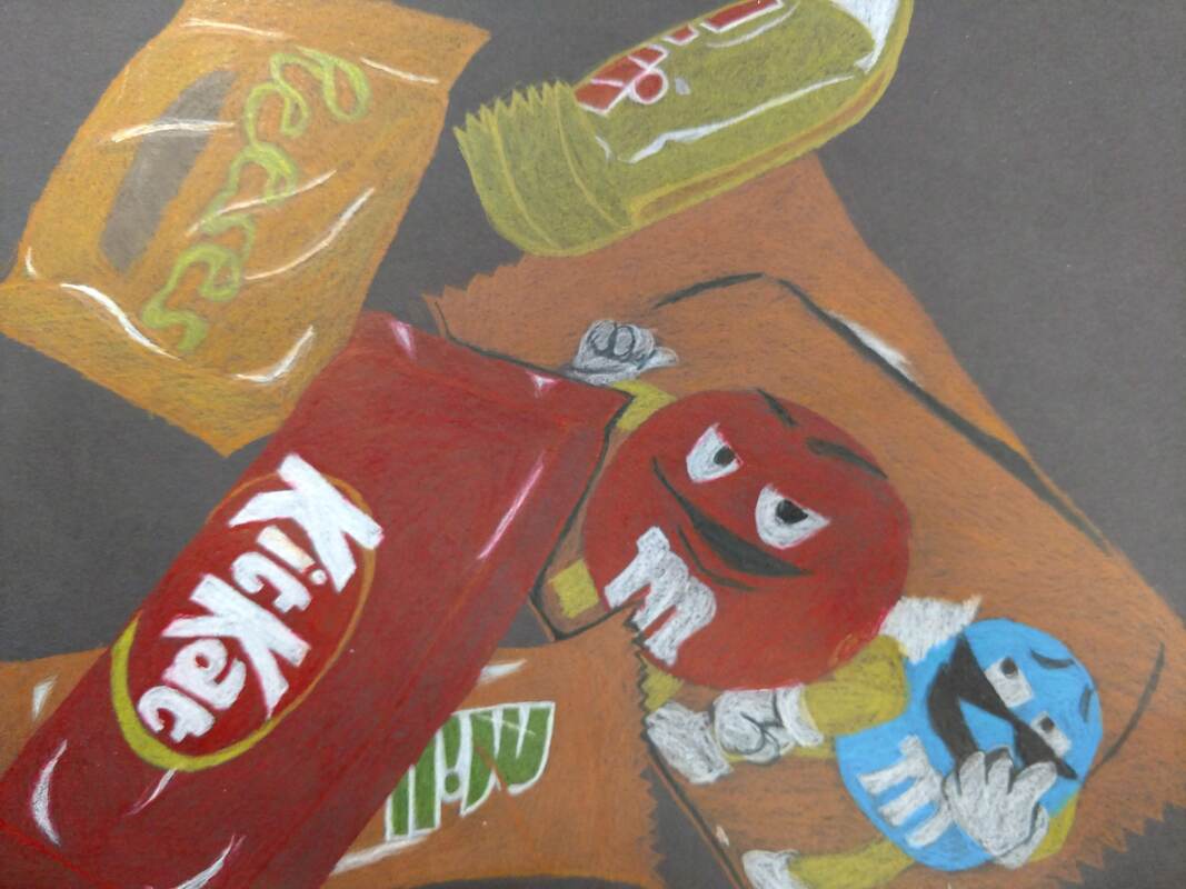
Colored Candy
|
Clear Candy
|
This mini project was to help us draw light and folds on solid and clear candy wrappers. It was much easier to draw the solid colored wrappers because the clear ones had so much detail to them. The folds where the hardest part.
|
|
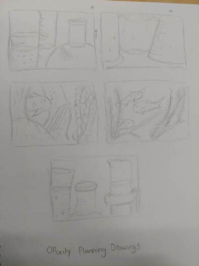
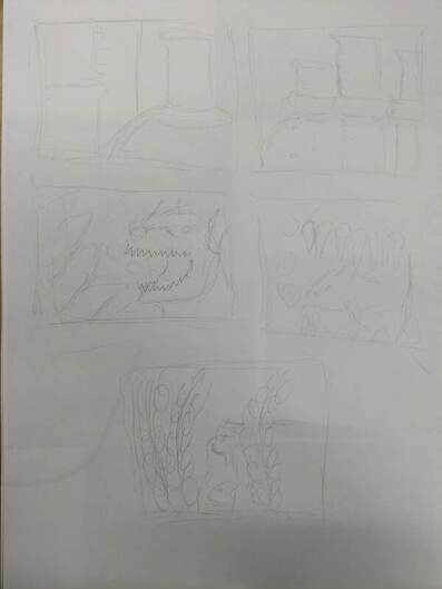
Planning Drafts
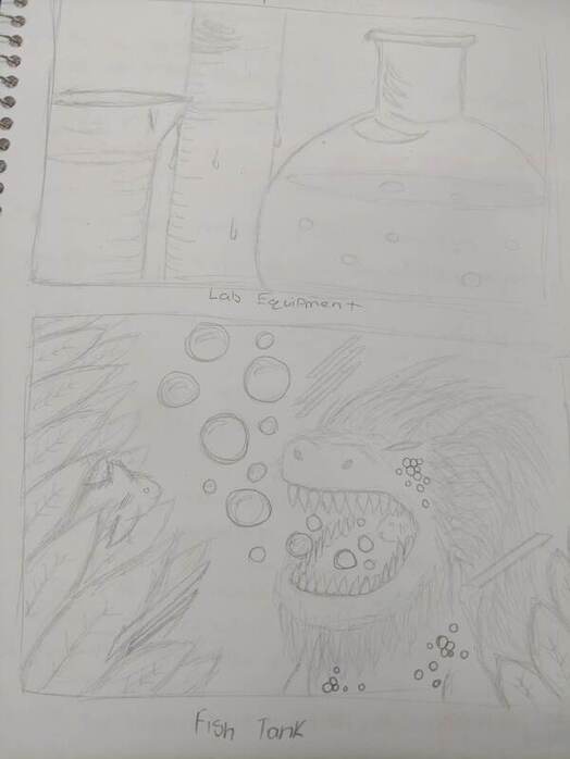
Final Planning
Progress 1
Progress 3
|
Progress 2
Progress 4
|
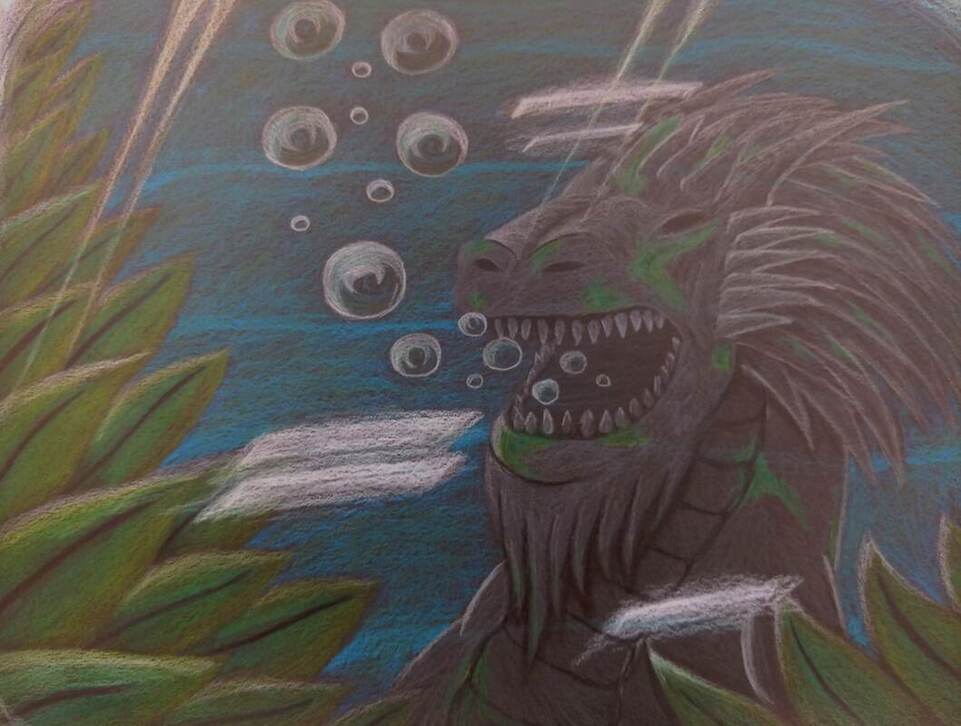
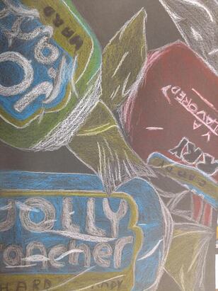
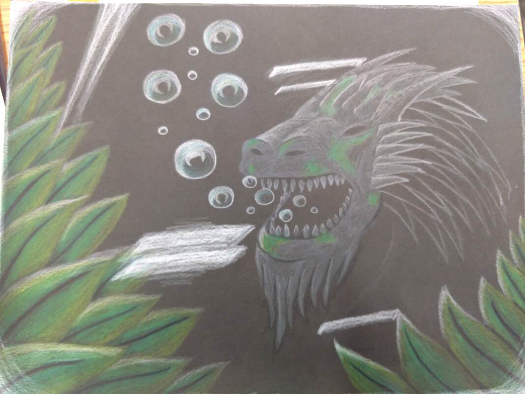
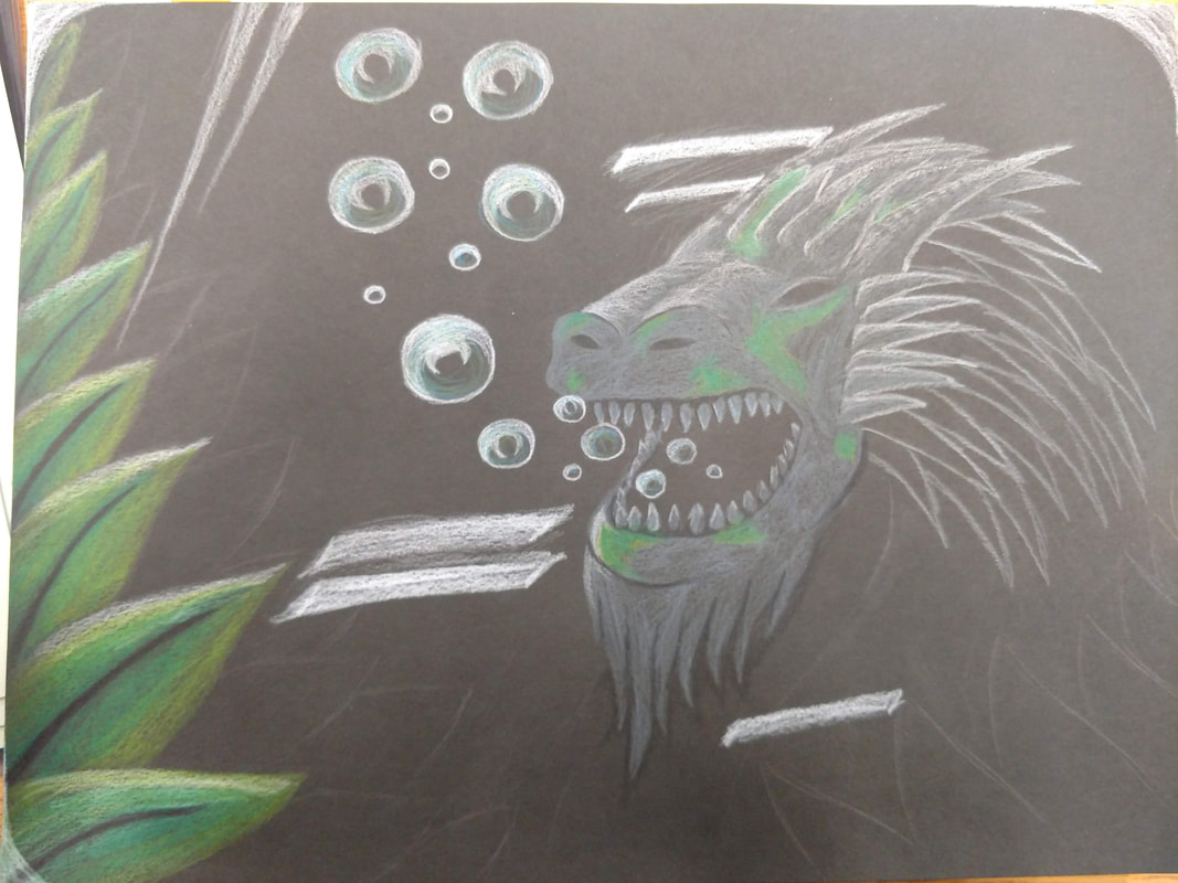
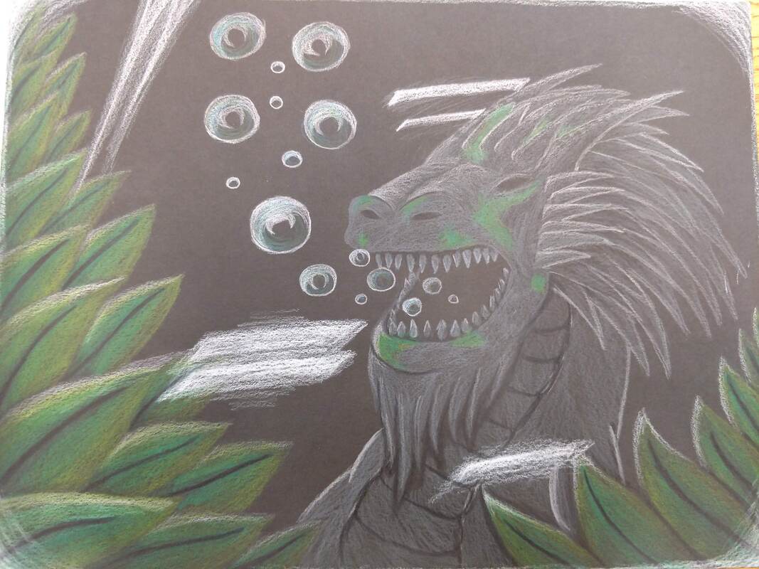
Opacity Drawing- Final
1) The craftsmanship of the drawing is much better than I was expecting. The lines are used for specific details and the leaves have a gradient from dark to light that mix very well.
2)-----
3) For all of the colors, I used different shades to make lighting look realistic and to add contrast to different areas. Most of this drawing has cool colors like green and blue. The use of black and grey was to show extreme shadows and light sources.
4) I created contrast in my drawing my making the outlines of each subject very visible and made sure the colors did not accidentally bleed into the other colors. Specifically the stone dragon, I needed the bubbles to come out of the mouth with appropriate shading.
5) A lot of the texture in the drawing is seen on the stone dragon and the background. The moss on the dragon needed to look like it was on top of the dragons' surface. The background needed to look like it was flowing, so I used a brighter shade to make lines more visible than the rest of the blue background.
6) Since the drawing is inside of a fish tank, the background would be mostly water. I added some green shades to make it look reflective to the plants in the foreground.
7) In order to use prismacolor pencils, you need to know how to apply the appropriate pressure to make different shades. You also need to make the appropriate textures. The plants show why good pressure control is needed to make sure the color shades flow smoothly.
8) The main difficulty of my drawing was to make it look like you are looking through glass. For this, I made light glares you would see through the glass. If I could make it look more realistic, it would improve the overall feel of the drawing.
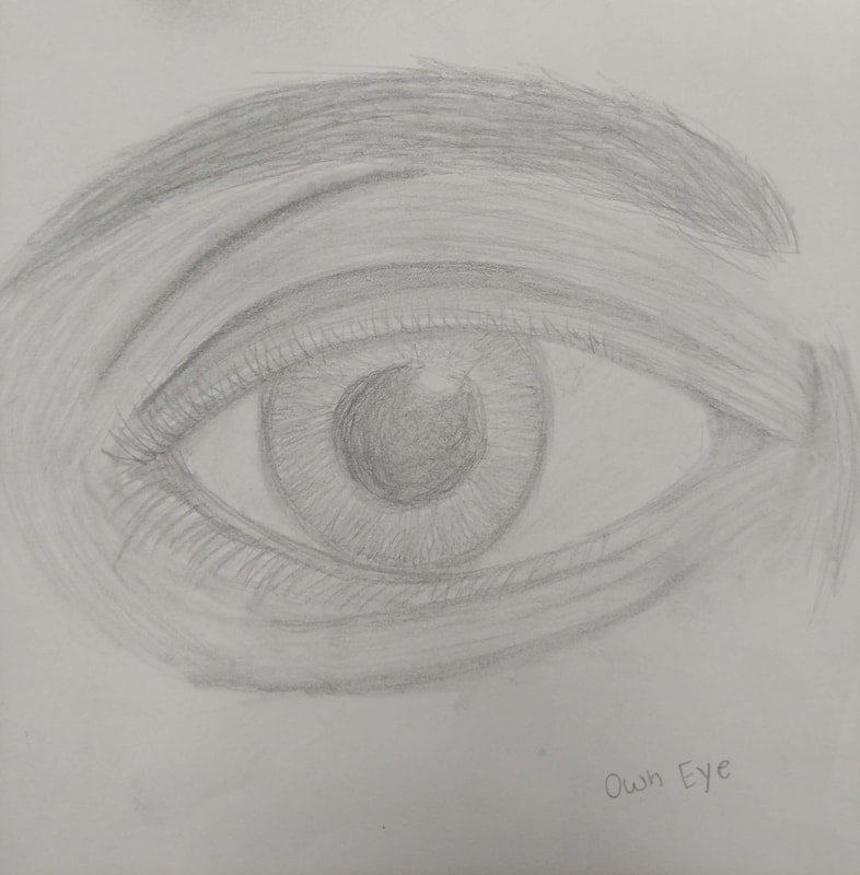
Eye drawing
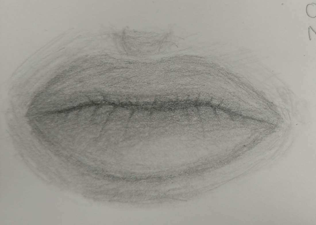
Mouth Drawing
For out subject, we are drawing realistic faces. These drawings are mainly practices of the features using my own face and features. Personally, I enjoy drawing faces so I have some previous knowledge on this subject.
|
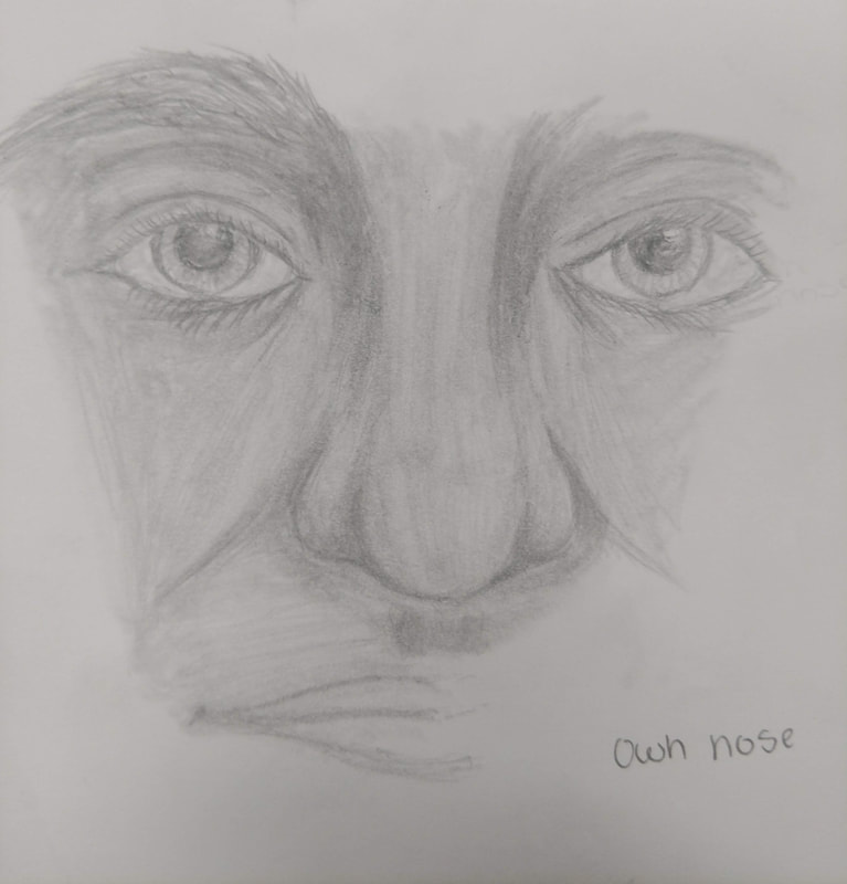
Nose drawing with eyes
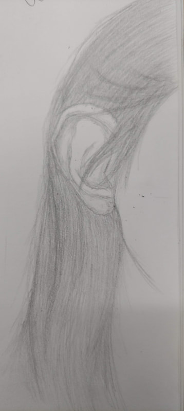
Hair and Ear drawing
|
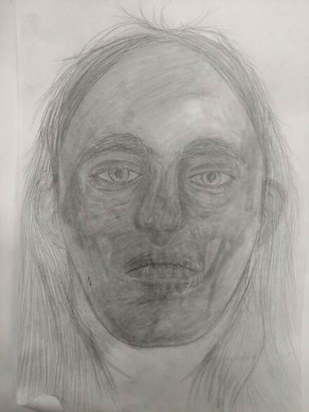
Own full face drawing
|
For this mini assignment, we had a skull and we used it to draw a proportional face. We had to use an image of our own face and do our best to draw it over the skull. I chose not to include my glasses because they can effect how my eyes look. The best part of my drawing is probably the eyes but i can improve on the nose and mouth. They are where I struggle.
|
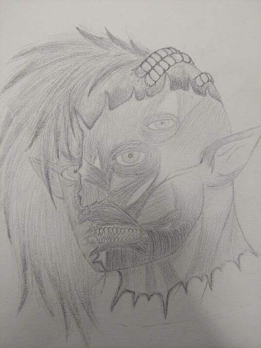
Final Project- Portrait
1- For this project I wanted to do something that had complex anatomy. I realized I was doing something that has been done alot so I also wanted to add some out of place objects but still keep it mostly human anatomy.
2-Most of the different values are the thickness of the face muscles. The edge of the skin also had to be darker so it would be easier to tell the different halves apart. The tips of the hair had to be darker due to the way the hair is done.
3-I feel like I did well with the values in the muscles due to how I had to draw them. The more the lines come together, the darker the value is. She skin had to be darker to make sure it was contrasting.
4-I feel the amount of lines I had would normally make my drawing look messy, This time, they are more uniform and neat, showing that i have overall improved. This drawing looks neater than my past drawings.
5-This portrait has parts of my inner image. It may have the same shape as my own face, but the hair is wild and messy and the features are sharp.
6-To make sure my facial features where proportionate, I used the eyes as a measuring tools. I also have prior knowledge in drawing faces to know what looks and is proportionate.
7-Knowing how to draw all the features individually is a good way to know if you can draw various facial shapes. Knowing how to draw one thing and also knowing how to modify it to fit various face shapes.
8-The most beneficial part of this unit was improving the way I draw faces and facial features. I enjoy drawing them and knowing the little mistakes I do helps me improve.
9-The largest thing I had to overcome in this project was my ability to draw consistant lines and not use sketchy lines. I just had to train my hands to be steady.
|
|
|
|
|
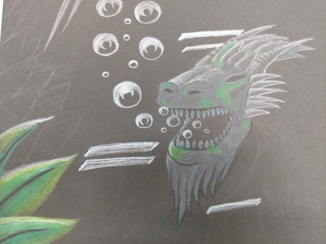
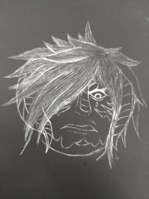
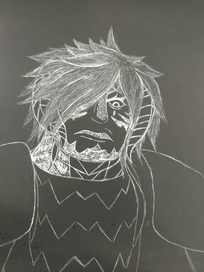
Planning Sketch+In Progress
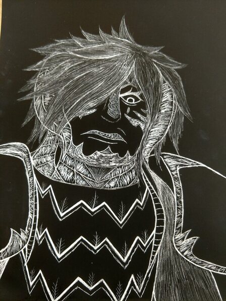
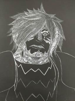
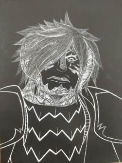
Implied Movement Final
1) The subject of my image was a character I made. It is a fantasy dragon knight. I had to refer to my own drawings and ideas to make this.
2) Most of the textures can be found in the scales on the face and neck. I had to make sure they did not blend together. I made the lines go in various directions to imply movement in both the scales and the hair.
3) I tried to make the armor not too bland so the negative black space would not take up too much of the picture. I put bold lines where they where needed and added texture to the appropriate areas.
4) Most of my implied movement is in the hair, the face and neck scales. The varied flow of the lines makes it more interesting to look at and the hair flows smoothly from one way to another.
5) This piece can be improved by making sure my lines are more consistant and less sketchy. I could also add more subject matter too the background to make the art more appealing.
6) The shading is not very present in this piece. You can see some variance in the hair where the lines get closer together to make a more pronounced line and the face has different shades to differenciate the skales and the skin.
